Landings

Example 1
Landing Page Example 1
Themes
You can use a variety of Bootstrap 5 themes to make your application more attractive.
Bootstrap 5 ThemesBootstrap Examples
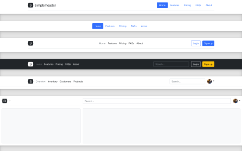
Headers
Display your branding, navigation, search, and more with these header components
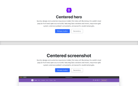
Heroes
Set the stage on your homepage with heroes that feature clear calls to action.
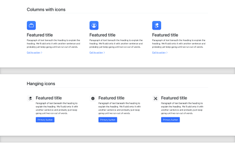
Features
Explain the features, benefits, or other details in your marketing content.
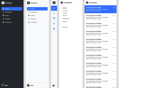
Sidebars
Common navigation patterns ideal for offcanvas or multi-column layouts.
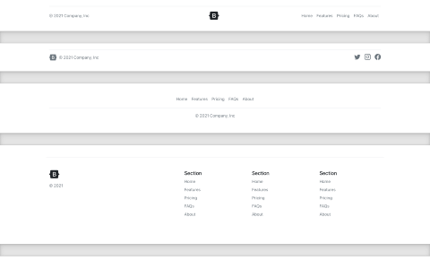
Footers
Finish every page strong with an awesome footer, big or small.
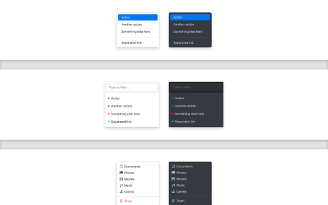
Dropdowns
Enhance your dropdowns with filters, icons, custom styles, and more.
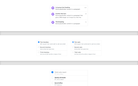
List groups
Extend list groups with utilities and custom styles for any content.
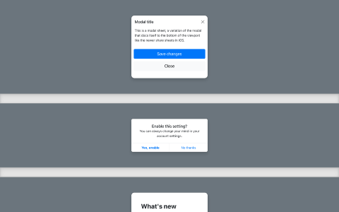
Modals
Transform modals to serve any purpose, from feature tours to dialogs.
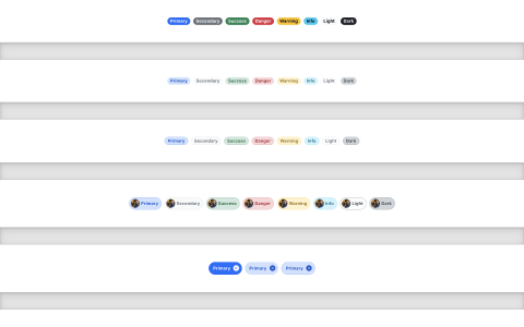
Badges
Make badges work with custom inner HTML and new looks.
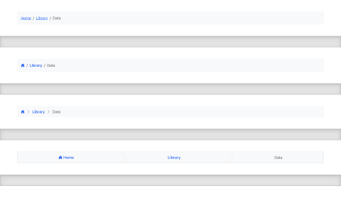
Breadcrumbs
Integrate custom icons and create stepper components.
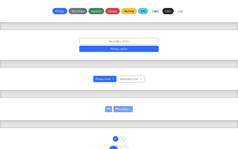
Buttons
Create custom buttons for just about any use case with utilities.
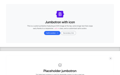
Jumbotrons
Create modernized versions of the classic Bootstrap component.
Custom Components
Brand-new components and templates to help folks quickly get started with Bootstrap and demonstrate best practices for adding onto the framework.
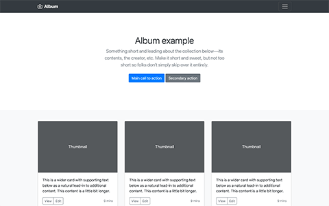
Album
Simple one-page template for photo galleries, portfolios, and more.
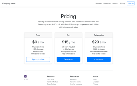
Pricing
Example pricing page built with Cards and featuring a custom header and footer.
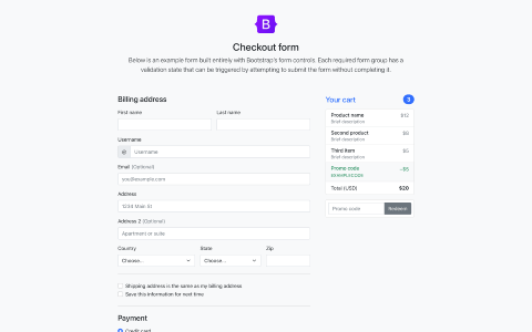
Checkout
Custom checkout form showing our form components and their validation features.
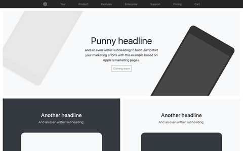
Product
Lean product-focused marketing page with extensive grid and image work.
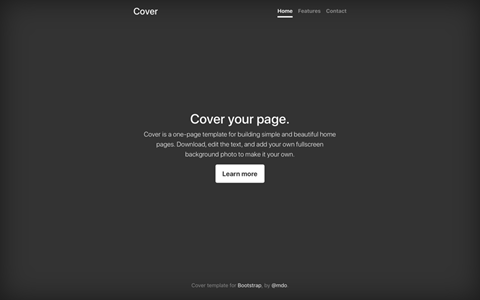
Cover
A one-page template for building simple and beautiful home pages.
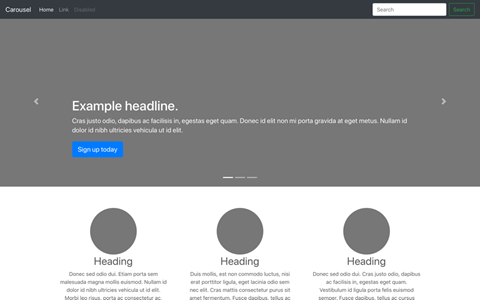
Carousel
Customize the navbar and carousel, then add some new components.
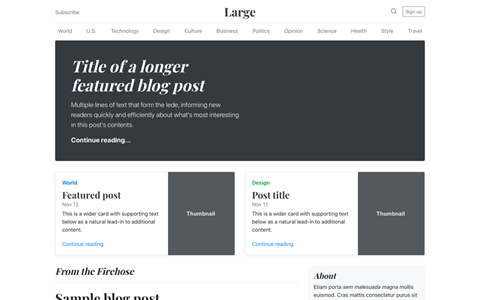
Blog
Magazine like blog template with header, navigation, featured content.
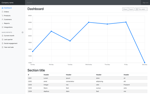
Dashboard
Basic admin dashboard shell with fixed sidebar and navbar.
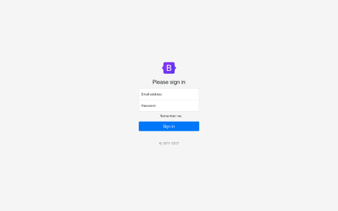
Sign-in
Custom form layout and design for a simple sign in form.
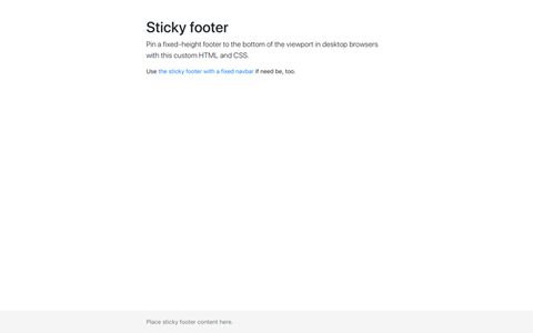
Sticky footer
Attach a footer to the bottom of the viewport when page content is short.
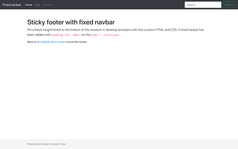
Sticky footer navbar
Attach a footer to the bottom of the viewport with a fixed top navbar.
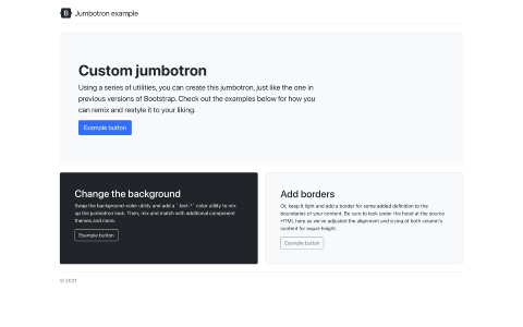
Jumbotron
Use utilities to recreate and enhance Bootstrap 4's jumbotron.
Framework
Examples that focus on implementing uses of built-in components provided by Bootstrap.
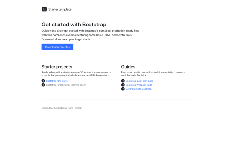
Starter template
Nothing but the basics: compiled CSS and JavaScript.
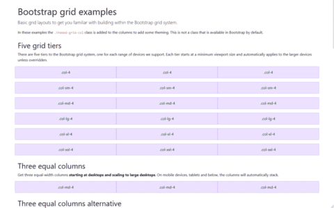
Grid
Multiple examples of grid layouts with all four tiers, nesting, and more.
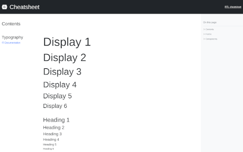
Cheatsheet
Kitchen sink of Bootstrap components.
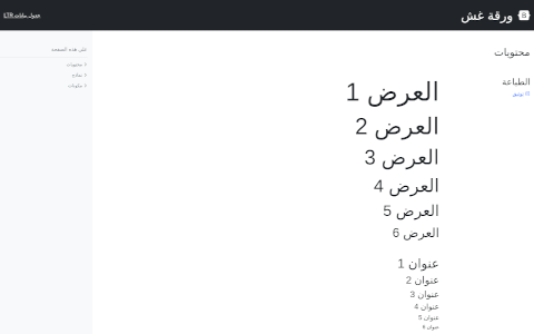
Cheatsheet RTL
Kitchen sink of Bootstrap components, RTL.
Navbars
Taking the default navbar component and showing how it can be moved, placed, and extended.
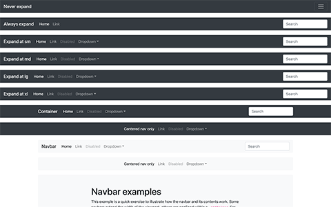
Navbars
Demonstration of all responsive and container options for the navbar.
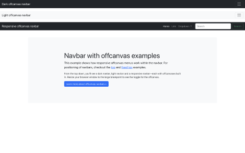
Navbars offcanvas
Same as the Navbars example, but with our offcanvas component.
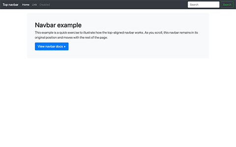
Navbar static
Single navbar example of a static top navbar along with some additional content.
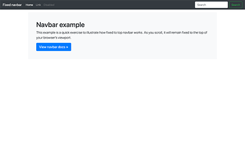
Navbar fixed
Single navbar example with a fixed top navbar along with some additional content.
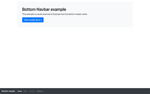
Navbar bottom
Single navbar example with a bottom navbar along with some additional content.
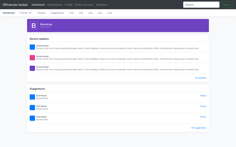
Offcanvas navbar
Turn your expandable navbar into a sliding offcanvas menu (doesn't use our offcanvas component).
RTL
See Bootstrap's RTL version in action with these modified Custom Components examples.
RTL is still experimental and will evolve with feedback. Spotted something or have an improvement to suggest?
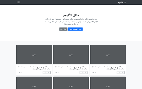
Album RTL
Simple one-page template for photo galleries, portfolios, and more.
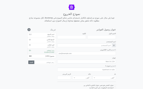
Checkout RTL
Custom checkout form showing our form components and their validation features.
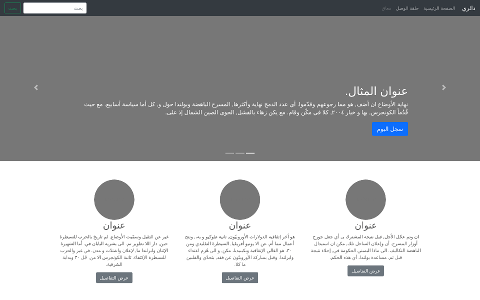
Carousel RTL
Customize the navbar and carousel, then add some new components.
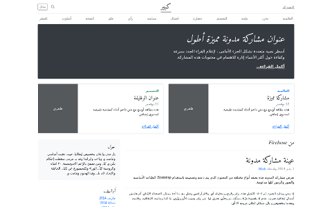
Blog RTL
Magazine like blog template with header, navigation, featured content.
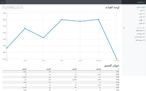
Dashboard RTL
Basic admin dashboard shell with fixed sidebar and navbar.
Integrations
Integrations with external libraries.
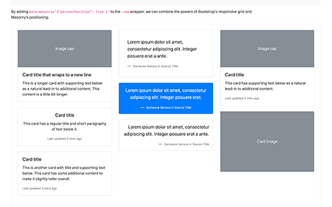
Masonry
Combine the powers of the Bootstrap grid and the Masonry layout.