About
A card is a flexible and extensible content container.
It includes options for headers and footers, a wide variety of content, contextual background colors, and powerful display options.
If you're familiar with Bootstrap 3, cards replace our old panels, wells, and thumbnails.
Similar functionality to those components is available as modifier classes for cards.
Example
Cards are built with as little markup and styles as possible, but still manage to deliver a ton of control and customization.
Built with flexbox, they offer easy alignment and mix well with other Bootstrap components.
They have no margin by default, so use [spacing utilities] as needed.
Below is an example of a basic card with mixed content and a fixed width. Cards have no fixed width to start, so they'll naturally fill the full width of its parent element.
This is easily customized with our various sizing options.

Card title
Some quick example text to build on the card title and make up the bulk of the card's content.
Go somewhere<template>
<Card>
<CardImgTop
src="/unsplash/image/coffee/tyler-nix-WZLBfkRg-KM-unsplash.jpg"
alt="..."
/>
<CardBody>
<CardTitle>Card title</CardTitle>
<CardText>
Some quick example text to build on the card title and make up the bulk
of the card's content.
</CardText>
<Anchor
to="/"
button
color="primary"
>
Go somewhere
</Anchor>
</CardBody>
</Card>
</template>
Content types
Cards support a wide variety of content, including images, text, list groups, links, and more. Below are examples of what's supported.
Body
The building block of a card is the CardBody. Use it whenever you need a padded section within a card.
<template>
 <Card>
  <CardBody>This is some text within a card body.</CardBody>
 </Card>
</template>
Titles, text, and links
Card titles are used by adding CardTitle component.
In the same way, links are added and placed next to each other by adding `CardLink` tag.
Subtitles are used by adding a CardSubTitle component.
If the CardTitle and the CardSubTitle items are placed in a CardBody item, the card title and subtitle are aligned nicely.
Card title
Card subtitle
Some quick example text to build on the card title and make up the bulk of the card's content.
Card linkAnother link<template>
<Card style="width: 18rem">
<CardBody>
<CardTitle>Card title</CardTitle>
<CardSubTitle
margin="b-2"
text-color="body-secondary"
>
Card subtitle
</CardSubTitle>
<CardText>
Some quick example text to build on the card title and make up the bulk
of the card's content.
</CardText>
<CardLink>Card link</CardLink>
<CardLink>Another link</CardLink>
</CardBody>
</Card>
</template>
Images
CardImgTop component places an image to the top of the card.
With CardTextcomponent, text can be added to the card. Text within CardText component can also be styled with the standard HTML tags.

Some quick example text to build on the card title and make up the bulk of the card's content.
<template>
 <Card>
  <CardImgTop
   src="/unsplash/image/coffee/nathan-dumlao-6VhPY27jdps-unsplash.jpg"
   alt="..."
  />
  <CardBody>
   <CardText>
    Some quick example text to build on the card title and make up the bulk
    of the card's content.
   </CardText>
  </CardBody>
 </Card>
</template>
List groups
Create lists of content in a card with a flush list group.
<template>
 <Card style="width: 18rem">
  <ListGroup flush>
   <ListGroupItem>An item</ListGroupItem>
   <ListGroupItem>A second item</ListGroupItem>
   <ListGroupItem>A third item</ListGroupItem>
  </ListGroup>
 </Card>
</template>
<template>
 <Card style="width: 18rem">
  <CardHeader>Featured</CardHeader>
  <ListGroup flush>
   <ListGroupItem>An item</ListGroupItem>
   <ListGroupItem>A second item</ListGroupItem>
   <ListGroupItem>A third item</ListGroupItem>
  </ListGroup>
 </Card>
</template>
<template>
 <Card style="width: 18rem">
  <ListGroup flush>
   <ListGroupItem>An item</ListGroupItem>
   <ListGroupItem>A second item</ListGroupItem>
   <ListGroupItem>A third item</ListGroupItem>
  </ListGroup>
  <CardFooter>Featured</CardFooter>
 </Card>
</template>
Kitchen sink
Mix and match multiple content types to create the card you need, or throw everything in there. Shown below are image styles, blocks, text styles, and a list group—all wrapped in a fixed-width card.

Card title
Some quick example text to build on the card title and make up the bulk of the card's content.
Go somewhere<template>
<Card>
<CardImgTop
src="/unsplash/image/coffee/nathan-dumlao-6VhPY27jdps-unsplash.jpg"
alt="..."
/>
<CardBody>
<CardTitle>Card title</CardTitle>
<CardText>
Some quick example text to build on the card title and make up the bulk
of the card's content.
</CardText>
<Anchor
to="/"
button
color="primary"
>
Go somewhere
</Anchor>
</CardBody>
<ListGroup flush>
<ListGroupItem>An item</ListGroupItem>
<ListGroupItem>A second item</ListGroupItem>
<ListGroupItem>A third item</ListGroupItem>
</ListGroup>
<CardBody>
<CardLink>Card link</CardLink>
<CardLink>Another link</CardLink>
</CardBody>
</Card>
</template>
Header and footer
Add an optional header and/or footer within a card.
Special title treatment
With supporting text below as a natural lead-in to additional content.
Go somewhere<template>
<Card>
<CardHeader>Featured</CardHeader>
<CardBody>
<CardTitle>Special title treatment</CardTitle>
<CardText>
With supporting text below as a natural lead-in to additional content.
</CardText>
<Anchor
to="/"
button
color="primary"
>
Go somewhere
</Anchor>
</CardBody>
</Card>
</template>
Card headers can be styled by adding CardHeader elements.
Special title treatment
Some quick example text to build on the card title and make up the bulk of the card's content.
Go somewhere<template>
<Card>
<CardHeader>Featured</CardHeader>
<CardBody>
<CardTitle>Special title treatment</CardTitle>
<CardText>
Some quick example text to build on the card title and make up the bulk
of the card's content.
</CardText>
<Anchor
to="/"
button
color="primary"
>
Go somewhere
</Anchor>
</CardBody>
</Card>
</template>
A well-known quote, contained in a blockquote element.
<template>
 <Card>
  <CardHeader>Quote</CardHeader>
  <CardBody>
   <BBlockquote margin="b-0">
    <b-p>A well-known quote, contained in a blockquote element.</b-p>
    <BBlockquoteFooter tag="footer">
     Someone famous in
     <cite title="Source Title">Source Title</cite>
    </BBlockquoteFooter>
   </BBlockquote>
  </CardBody>
 </Card>
</template>
Special title treatment
Some quick example text to build on the card title and make up the bulk of the card's content.
Go somewhere<template>
<Card text-alignment="center">
<CardHeader>Featured</CardHeader>
<CardBody>
<CardTitle>Special title treatment</CardTitle>
<CardText>
Some quick example text to build on the card title and make up the bulk
of the card's content.
</CardText>
<Anchor
to="/"
button
color="primary"
>
Go somewhere
</Anchor>
</CardBody>
<CardFooter text-color="body-secondary">
2 days ago
</CardFooter>
</Card>
</template>
Sizing
Cards assume no specific width to start, so they'll be 100% wide unless otherwise stated.
You can change this as needed with custom CSS, grid classes, grid Sass mixins, or utilities.
Using grid markup
Using the grid, wrap cards in columns and rows as needed.
Special title treatment
With supporting text below as a natural lead-in to additional content.
Go somewhereSpecial title treatment
With supporting text below as a natural lead-in to additional content.
Go somewhere<template>
<Row>
<Col col="sm-6">
<Card>
<CardBody>
<CardTitle>Special title treatment</CardTitle>
<CardText>
With supporting text below as a natural lead-in to additional
content.
</CardText>
<Anchor
to="/"
button
color="primary"
>
Go somewhere
</Anchor>
</CardBody>
</Card>
</Col>
<Col col="sm-6">
<Card>
<CardBody>
<CardTitle>Special title treatment</CardTitle>
<CardText>
With supporting text below as a natural lead-in to additional
content.
</CardText>
<Anchor
to="/"
button
color="primary"
>
Go somewhere
</Anchor>
</CardBody>
</Card>
</Col>
</Row>
</template>
Using utilities
Use relative-width attribute to quickly set a card's width.
Card title
Some quick example text to build on the card title and make up the bulk of the card's content.
Go somewhereCard title
Some quick example text to build on the card title and make up the bulk of the card's content.
Go somewhere<template>
<Card relative-width="75">
<CardBody>
<CardTitle>Card title</CardTitle>
<CardText>
Some quick example text to build on the card title and make up the bulk
of the card's content.
</CardText>
<Anchor
to="/"
color="primary"
>
Go somewhere
</Anchor>
</CardBody>
</Card>
<Card relative-width="50">
<CardBody>
<CardTitle>Card title</CardTitle>
<CardText>
Some quick example text to build on the card title and make up the bulk
of the card's content.
</CardText>
<Anchor
to="/"
color="primary"
>
Go somewhere
</Anchor>
</CardBody>
</Card>
</template>
Using custom CSS
Use custom CSS in your stylesheets or as inline styles to set a width.
Special title treatment
With supporting text below as a natural lead-in to additional content.
Go somewhere<template>
<Row>
<Col col="6">
<Card style="width: 18rem">
<CardBody>
<CardTitle>Special title treatment</CardTitle>
<CardText>
With supporting text below as a natural lead-in to additional
content.
</CardText>
<Anchor
to="/"
button
color="primary"
>
Go somewhere
</Anchor>
</CardBody>
</Card>
</Col>
</Row>
</template>
Text alignment
You can quickly change the text alignment of any card—in its entirety or specific parts—with our text align classes,docsref "/utilities/text#text-alignment".
Special title treatment
With supporting text below as a natural lead-in to additional content.
Go somewhereSpecial title treatment
With supporting text below as a natural lead-in to additional content.
Go somewhereSpecial title treatment
With supporting text below as a natural lead-in to additional content.
Go somewhere<template>
<Card style="width: 18rem">
<CardBody>
<CardTitle>Special title treatment</CardTitle>
<CardText>
With supporting text below as a natural lead-in to additional content.
</CardText>
<Anchor
to="/"
button
color="primary"
>
Go somewhere
</Anchor>
</CardBody>
</Card>
<Card
text-alignment="center"
style="width: 18rem"
>
<CardBody>
<CardTitle>Special title treatment</CardTitle>
<CardText>
With supporting text below as a natural lead-in to additional content.
</CardText>
<Anchor
to="/"
button
color="primary"
>
Go somewhere
</Anchor>
</CardBody>
</Card>
<Card
text-alignment="end"
style="width: 18rem"
>
<CardBody>
<CardTitle>Special title treatment</CardTitle>
<CardText>
With supporting text below as a natural lead-in to additional content.
</CardText>
<Anchor
to="/"
button
color="primary"
>
Go somewhere
</Anchor>
</CardBody>
</Card>
</template>
Navigation
Add some navigation to a card's header (or block) with Bootstrap's Nav component, docsref "/components/navs-tabs".
Special title treatment
With supporting text below as a natural lead-in to additional content.
Go somewhere<template>
<Card text-alignment="center">
<CardHeader>
<Nav card>
<NavItem>
<NavLink
to="/lang-[lang]/components/card"
dynamic-route
>
Active
</NavLink>
</NavItem>
<NavItem>
<NavLink
to="/lang-[lang]"
dynamic-route
>
Link
</NavLink>
</NavItem>
<NavItem>
<NavLink
disabled
to="/lang-[lang]"
dynamic-route
>
Disabled
</NavLink>
</NavItem>
</Nav>
</CardHeader>
<CardBody>
<CardTitle>Special title treatment</CardTitle>
<CardText>
With supporting text below as a natural lead-in to additional content.
</CardText>
<Anchor
to="/"
button
color="primary"
>
Go somewhere
</Anchor>
</CardBody>
</Card>
</template>
Special title treatment
With supporting text below as a natural lead-in to additional content.
Go somewhere<template>
<Card text-alignment="center">
<CardHeader>
<Nav card>
<NavItem>
<NavLink
to="/lang-[lang]/components/card"
dynamic-route
>
Active
</NavLink>
</NavItem>
<NavItem>
<NavLink
to="/lang-[lang]/"
dynamic-route
>
Link
</NavLink>
</NavItem>
<NavItem>
<NavLink
disabled
to="/lang-en/"
>
Disabled
</NavLink>
</NavItem>
</Nav>
</CardHeader>
<CardBody>
<CardTitle>Special title treatment</CardTitle>
<CardText>
With supporting text below as a natural lead-in to additional content.
</CardText>
<Anchor
to="/"
button
color="primary"
>
Go somewhere
</Anchor>
</CardBody>
</Card>
</template>
Images
Cards include a few options for working with images. Choose from appending "image caps" at either end of a card, overlaying images with card content, or simply embedding the image in a card.
Image caps
Similar to headers and footers, cards can include top and bottom "image caps"—images at the top or bottom of a card.

Card title
Some quick example text to build on the card title and make up the bulk of the card's content.
Last updated 3 mins ago
Card title
Some quick example text to build on the card title and make up the bulk of the card's content.
Last updated 3 mins ago

<template>
 <Card margin="b-3">
  <CardImgTop
   src="/unsplash/image/coffee/tyler-nix-WZLBfkRg-KM-unsplash.jpg"
   alt="..."
  />
  <CardBody>
   <CardTitle>Card title</CardTitle>
   <CardText>
    Some quick example text to build on the card title and make up the bulk
    of the card's content.
   </CardText>
   <CardText
    text-color="body-secondary"
    small
   >
    Last updated 3 mins ago
   </CardText>
  </CardBody>
 </Card>
 <Card>
  <CardBody>
   <CardTitle>Card title</CardTitle>
   <CardText>
    Some quick example text to build on the card title and make up the bulk
    of the card's content.
   </CardText>
   <CardText
    text-color="body-secondary"
    small
   >
    Last updated 3 mins ago
   </CardText>
  </CardBody>
  <CardImgBottom
   src="/unsplash/image/coffee/nathan-dumlao-6VhPY27jdps-unsplash.jpg"
   alt="..."
  />
 </Card>
</template>
Image overlays
Turn an image into a card background and overlay your card's text.
Depending on the image, you may or may not need additional styles or utilities.
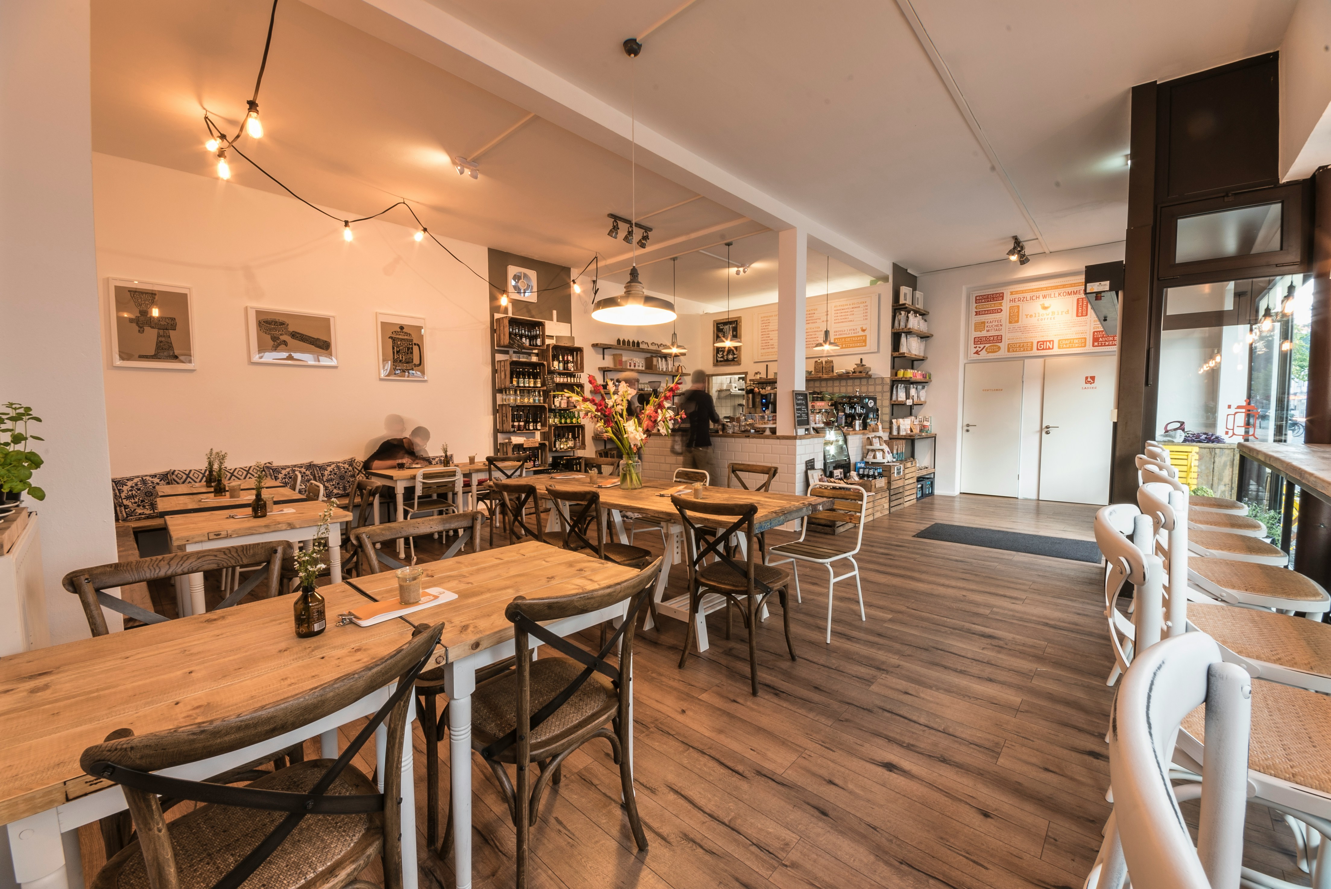
<template>
 <Card
  text-color="white"
  background-color="dark"
 >
  <CardImg
   src="/unsplash/image/cafe/janosch-lino-k6w8miMpfUI-unsplash.jpg"
   alt="..."
  />
  <CardImgOverlay>
   <CardTitle>Card title</CardTitle>
   <CardText>
    Some quick example text to build on the card title and make up the bulk
    of the card's content.
   </CardText>
   <CardText
    text-color="body-secondary"
    small
   >
    Last updated 3 mins ago
   </CardText>
  </CardImgOverlay>
 </Card>
</template>
tip
Note that content should not be larger than the height of the image.
If content is larger than the image the content will be displayed outside the image.
Horizontal
Using a combination of grid and utility classes, cards can be made horizontal in a mobile-friendly and responsive way. In the example below, we remove the grid gutters with gutter="0" attributes and use col="md-*" attributes to make the card horizontal at the md breakpoint. Further adjustments may be needed depending on your card content.

Card title
Some quick example text to build on the card title and make up the bulk of the card's content.
Last updated 3 mins ago
<template>
 <Card margin="b-3">
  <Row gutter="0">
   <Col col="md-4">
    <b-img
     fluid
     rounded="start"
     src="/unsplash/image/coffee/tyler-nix-WZLBfkRg-KM-unsplash.jpg"
     alt="..."
    />
   </Col>
   <Col col="md-8">
    <CardBody>
     <CardTitle>Card title</CardTitle>
     <CardText>
      Some quick example text to build on the card title and make up the
      bulk of the card's content.
     </CardText>
     <CardText
      text-color="body-secondary"
      small
     >
      Last updated 3 mins ago
     </CardText>
    </CardBody>
   </Col>
  </Row>
 </Card>
</template>
Card styles
Cards include various options for customizing their backgrounds, borders, and color.
Background and color
Use color utilities to change the appearance of a card.
Primary Card title
Some quick example text to build on the card title and make up the bulk of the card's content.
Secondary Card title
Some quick example text to build on the card title and make up the bulk of the card's content.
Success Card title
Some quick example text to build on the card title and make up the bulk of the card's content.
Danger Card title
Some quick example text to build on the card title and make up the bulk of the card's content.
Warning Card title
Some quick example text to build on the card title and make up the bulk of the card's content.
Info Card title
Some quick example text to build on the card title and make up the bulk of the card's content.
Light Card title
Some quick example text to build on the card title and make up the bulk of the card's content.
Dark Card title
Some quick example text to build on the card title and make up the bulk of the card's content.
<template>
 <Card
  color="primary"
  margin="b-3"
  style="max-width: 18rem"
 >
  <CardHeader>Header</CardHeader>
  <CardBody>
   <CardTitle>Primary Card title</CardTitle>
   <CardText>
    Some quick example text to build on the card title and make up the bulk
    of the card's content.
   </CardText>
  </CardBody>
 </Card>
 <Card
  color="secondary"
  margin="b-3"
  style="max-width: 18rem"
 >
  <CardHeader>Header</CardHeader>
  <CardBody>
   <CardTitle>Secondary Card title</CardTitle>
   <CardText>
    Some quick example text to build on the card title and make up the bulk
    of the card's content.
   </CardText>
  </CardBody>
 </Card>
 <Card
  color="success"
  margin="b-3"
  style="max-width: 18rem"
 >
  <CardHeader>Header</CardHeader>
  <CardBody>
   <CardTitle>Success Card title</CardTitle>
   <CardText>
    Some quick example text to build on the card title and make up the bulk
    of the card's content.
   </CardText>
  </CardBody>
 </Card>
 <Card
  color="danger"
  margin="b-3"
  style="max-width: 18rem"
 >
  <CardHeader>Header</CardHeader>
  <CardBody>
   <CardTitle>Danger Card title</CardTitle>
   <CardText>
    Some quick example text to build on the card title and make up the bulk
    of the card's content.
   </CardText>
  </CardBody>
 </Card>
 <Card
  color="warning"
  margin="b-3"
  style="max-width: 18rem"
 >
  <CardHeader>Header</CardHeader>
  <CardBody>
   <CardTitle>Warning Card title</CardTitle>
   <CardText>
    Some quick example text to build on the card title and make up the bulk
    of the card's content.
   </CardText>
  </CardBody>
 </Card>
 <Card
  color="info"
  margin="b-3"
  style="max-width: 18rem"
 >
  <CardHeader>Header</CardHeader>
  <CardBody>
   <CardTitle>Info Card title</CardTitle>
   <CardText>
    Some quick example text to build on the card title and make up the bulk
    of the card's content.
   </CardText>
  </CardBody>
 </Card>
 <Card
  color="light"
  margin="b-3"
  style="max-width: 18rem"
 >
  <CardHeader>Header</CardHeader>
  <CardBody>
   <CardTitle>Light Card title</CardTitle>
   <CardText>
    Some quick example text to build on the card title and make up the bulk
    of the card's content.
   </CardText>
  </CardBody>
 </Card>
 <Card
  color="dark"
  margin="b-3"
  style="max-width: 18rem"
 >
  <CardHeader>Header</CardHeader>
  <CardBody>
   <CardTitle>Dark Card title</CardTitle>
   <CardText>
    Some quick example text to build on the card title and make up the bulk
    of the card's content.
   </CardText>
  </CardBody>
 </Card>
</template>
Border
Primary Card title
Some quick example text to build on the card title and make up the bulk of the card's content.
Secondary Card title
Some quick example text to build on the card title and make up the bulk of the card's content.
Success Card title
Some quick example text to build on the card title and make up the bulk of the card's content.
Danger Card title
Some quick example text to build on the card title and make up the bulk of the card's content.
Warning Card title
Some quick example text to build on the card title and make up the bulk of the card's content.
Info Card title
Some quick example text to build on the card title and make up the bulk of the card's content.
Light Card title
Some quick example text to build on the card title and make up the bulk of the card's content.
Dark Card title
Some quick example text to build on the card title and make up the bulk of the card's content.
Border subtractive Card title
Some quick example text to build on the card title and make up the bulk of the card's content.
<template>
 <b-div padding="3">
  <Card
   border-color="primary"
   margin="b-3"
   style="max-width: 18rem"
  >
   <CardHeader>Header</CardHeader>
   <CardBody text-color="primary">
    <CardTitle>Primary Card title</CardTitle>
    <CardText>
     Some quick example text to build on the card title and make up the
     bulk of the card's content.
    </CardText>
   </CardBody>
  </Card>
  <Card
   border-color="secondary"
   margin="b-3"
   style="max-width: 18rem"
  >
   <CardHeader>Header</CardHeader>
   <CardBody text-color="secondary">
    <CardTitle>Secondary Card title</CardTitle>
    <CardText>
     Some quick example text to build on the card title and make up the
     bulk of the card's content.
    </CardText>
   </CardBody>
  </Card>
  <Card
   border-color="success"
   margin="b-3"
   style="max-width: 18rem"
  >
   <CardHeader>Header</CardHeader>
   <CardBody text-color="success">
    <CardTitle>Success Card title</CardTitle>
    <CardText>
     Some quick example text to build on the card title and make up the
     bulk of the card's content.
    </CardText>
   </CardBody>
  </Card>
  <Card
   border-color="danger"
   margin="b-3"
   style="max-width: 18rem"
  >
   <CardHeader>Header</CardHeader>
   <CardBody text-color="danger">
    <CardTitle>Danger Card title</CardTitle>
    <CardText>
     Some quick example text to build on the card title and make up the
     bulk of the card's content.
    </CardText>
   </CardBody>
  </Card>
  <Card
   border-color="warning"
   margin="b-3"
   style="max-width: 18rem"
  >
   <CardHeader>Header</CardHeader>
   <CardBody text-color="warning">
    <CardTitle>Warning Card title</CardTitle>
    <CardText>
     Some quick example text to build on the card title and make up the
     bulk of the card's content.
    </CardText>
   </CardBody>
  </Card>
  <Card
   border-color="info"
   margin="b-3"
   style="max-width: 18rem"
  >
   <CardHeader>Header</CardHeader>
   <CardBody text-color="info">
    <CardTitle>Info Card title</CardTitle>
    <CardText>
     Some quick example text to build on the card title and make up the
     bulk of the card's content.
    </CardText>
   </CardBody>
  </Card>
  <Card
   border-color="light"
   margin="b-3"
   style="max-width: 18rem"
  >
   <CardHeader>Header</CardHeader>
   <CardBody>
    <CardTitle>Light Card title</CardTitle>
    <CardText>
     Some quick example text to build on the card title and make up the
     bulk of the card's content.
    </CardText>
   </CardBody>
  </Card>
  <Card
   border-color="dark"
   margin="b-3"
   style="max-width: 18rem"
  >
   <CardHeader>Header</CardHeader>
   <CardBody text-color="dark">
    <CardTitle>Dark Card title</CardTitle>
    <CardText>
     Some quick example text to build on the card title and make up the
     bulk of the card's content.
    </CardText>
   </CardBody>
  </Card>
  <Card
   border-subtractive
   margin="b-3"
   style="max-width: 18rem"
  >
   <CardHeader border-subtractive>
    Header
   </CardHeader>
   <CardBody>
    <CardTitle>Border subtractive Card title</CardTitle>
    <CardText>
     Some quick example text to build on the card title and make up the
     bulk of the card's content.
    </CardText>
   </CardBody>
  </Card>
 </b-div>
</template>
Mixins utilities
You can also change the borders on the card header and footer as needed, and even remove their background-color with background-color="transparent" attribute.
Success card title
Some quick example text to build on the card title and make up the bulk of the card's content.
<template>
 <Card
  border-color="success"
  margin="b-3"
  style="max-width: 18rem"
 >
  <CardHeader
   background-color="transparent"
   border-color="success"
  >
   Header
  </CardHeader>
  <CardBody text-color="success">
   <CardTitle>Success card title</CardTitle>
   <CardText>
    Some quick example text to build on the card title and make up the bulk
    of the card's content.
   </CardText>
  </CardBody>
  <CardFooter
   background-color="transparent"
   border-color="success"
  >
   Footer
  </CardFooter>
 </Card>
</template>
Card layout
In addition to styling the content within cards, Bootstrap includes a few options for laying out series of cards. For the time being, these layout options are not yet responsive
Card groups
Use card groups to render cards as a single, attached element with equal width and height columns. Card groups start off stacked and use display: flex; to become attached with uniform dimensions starting at the sm breakpoint.
Card title
This is a wider card with supporting text below as a natural lead-in to additional content. This content is a little bit longer.
Last updated 3 mins ago

Card title
This card has supporting text below as a natural lead-in to additional content.
Last updated 3 mins ago
Card title
This is a wider card with supporting text below as a natural lead-in to additional content. This card has even longer content than the first to show that equal height action.
Last updated 3 mins ago
<template>
 <CardGroup>
  <Card>
   <CardImgTop
    src="/unsplash/image/cafe/claudio-poggio-xCK8kr0R0JE-unsplash.jpg"
    alt="..."
   />
   <CardBody>
    <CardTitle>Card title</CardTitle>
    <CardText>
     This is a wider card with supporting text below as a natural lead-in
     to additional content. This content is a little bit longer.
    </CardText>
    <CardText text-color="body-secondary">
     Last updated 3 mins ago
    </CardText>
   </CardBody>
  </Card>
  <Card>
   <CardImgTop
    src="/unsplash/image/cafe/janosch-lino-k6w8miMpfUI-unsplash.jpg"
    alt="..."
   />
   <CardBody>
    <CardTitle>Card title</CardTitle>
    <CardText>
     This card has supporting text below as a natural lead-in to additional
     content.
    </CardText>
    <CardText text-color="body-secondary">
     Last updated 3 mins ago
    </CardText>
   </CardBody>
  </Card>
  <Card>
   <CardImgTop
    src="/unsplash/image/cafe/roman-bozhko-OXXsAafHDeo-unsplash.jpg"
    alt="..."
   />
   <CardBody>
    <CardTitle>Card title</CardTitle>
    <CardText>
     This is a wider card with supporting text below as a natural lead-in
     to additional content. This card has even longer content than the
     first to show that equal height action.
    </CardText>
    <CardText text-color="body-secondary">
     Last updated 3 mins ago
    </CardText>
   </CardBody>
  </Card>
 </CardGroup>
</template>
When using card groups with footers, their content will automatically line up.

Card title
Some quick example text to build on the card title and make up the bulk of the card's content.

Card title
Some quick example text to build on the card title and make up the bulk of the card's content.

Card title
Some quick example text to build on the card title and make up the bulk of the card's content.
<template>
 <CardGroup>
  <Card>
   <CardImgTop
    src="/unsplash/image/cafe/claudio-poggio-xCK8kr0R0JE-unsplash.jpg"
    alt="..."
   />
   <CardBody>
    <CardTitle>Card title</CardTitle>
    <CardText>
     Some quick example text to build on the card title and make up the
     bulk of the card's content.
    </CardText>
   </CardBody>
   <CardFooter>
    <b-p text-color="body-secondary">
     Last updated 3 mins ago
    </b-p>
   </CardFooter>
  </Card>
  <Card>
   <CardImgTop
    src="/unsplash/image/cafe/janosch-lino-k6w8miMpfUI-unsplash.jpg"
    alt="..."
   />
   <CardBody>
    <CardTitle>Card title</CardTitle>
    <CardText>
     Some quick example text to build on the card title and make up the
     bulk of the card's content.
    </CardText>
   </CardBody>
   <CardFooter>
    <b-p text-color="body-secondary">
     Last updated 3 mins ago
    </b-p>
   </CardFooter>
  </Card>
  <Card>
   <CardImgTop
    src="/unsplash/image/cafe/roman-bozhko-OXXsAafHDeo-unsplash.jpg"
    alt="..."
   />
   <CardBody>
    <CardTitle>Card title</CardTitle>
    <CardText>
     Some quick example text to build on the card title and make up the
     bulk of the card's content.
    </CardText>
   </CardBody>
   <CardFooter>
    <b-p text-color="body-secondary">
     Last updated 3 mins ago
    </b-p>
   </CardFooter>
  </Card>
 </CardGroup>
</template>
Grid cards
Use the Bootstrap grid system and its Row components with columns to control how many grid columns (wrapped around your cards) you show per row. For example, here's columns="1 md-2" laying out the cards on one column, and columns="md-2" splitting four cards to equal width across multiple rows, from the medium breakpoint up.

Card title
This is a longer card with supporting text below as a natural lead-in to additional content. This content is a little bit longer.

Card title
This is a longer card with supporting text below as a natural lead-in to additional content. This content is a little bit longer.

Card title
This is a longer card with supporting text below as a natural lead-in to additional content.

Card title
This is a longer card with supporting text below as a natural lead-in to additional content. This content is a little bit longer.
<template>
 <Row
  columns="1 md-2"
  :gutter="4"
 >
  <Col>
   <Card>
    <CardImgTop
     src="/unsplash/image/cafe/claudio-poggio-xCK8kr0R0JE-unsplash.jpg"
     alt="..."
    />
    <CardBody>
     <CardTitle>Card title</CardTitle>
     <CardText>
      This is a longer card with supporting text below as a natural
      lead-in to additional content. This content is a little bit longer.
     </CardText>
    </CardBody>
   </Card>
  </Col>
  <Col>
   <Card>
    <CardImgTop
     src="/unsplash/image/cafe/janosch-lino-k6w8miMpfUI-unsplash.jpg"
     alt="..."
    />
    <CardBody>
     <CardTitle>Card title</CardTitle>
     <CardText>
      This is a longer card with supporting text below as a natural
      lead-in to additional content. This content is a little bit longer.
     </CardText>
    </CardBody>
   </Card>
  </Col>
  <Col>
   <Card>
    <CardImgTop
     src="/unsplash/image/cafe/roman-bozhko-OXXsAafHDeo-unsplash.jpg"
     alt="..."
    />
    <CardBody>
     <CardTitle>Card title</CardTitle>
     <CardText>
      This is a longer card with supporting text below as a natural
      lead-in to additional content.
     </CardText>
    </CardBody>
   </Card>
  </Col>
  <Col>
   <Card>
    <CardImgTop
     src="/unsplash/image/cafe/daan-evers-tKN1WXrzQ3s-unsplash.jpg"
     alt="..."
    />
    <CardBody>
     <CardTitle>Card title</CardTitle>
     <CardText>
      This is a longer card with supporting text below as a natural
      lead-in to additional content. This content is a little bit longer.
     </CardText>
    </CardBody>
   </Card>
  </Col>
 </Row>
</template>
Change it to columns="3" and you'll see the fourth card wrap.

Card title
This is a longer card with supporting text below as a natural lead-in to additional content. This content is a little bit longer.

Card title
This is a longer card with supporting text below as a natural lead-in to additional content. This content is a little bit longer.

Card title
This is a longer card with supporting text below as a natural lead-in to additional content.

Card title
This is a longer card with supporting text below as a natural lead-in to additional content. This content is a little bit longer.
<template>
 <Row
  columns="1 md-3"
  :gutter="4"
 >
  <Col>
   <Card>
    <CardImgTop
     src="/unsplash/image/cafe/claudio-poggio-xCK8kr0R0JE-unsplash.jpg"
     alt="..."
    />
    <CardBody>
     <CardTitle>Card title</CardTitle>
     <CardText>
      This is a longer card with supporting text below as a natural
      lead-in to additional content. This content is a little bit longer.
     </CardText>
    </CardBody>
   </Card>
  </Col>
  <Col>
   <Card>
    <CardImgTop
     src="/unsplash/image/cafe/janosch-lino-k6w8miMpfUI-unsplash.jpg"
     alt="..."
    />
    <CardBody>
     <CardTitle>Card title</CardTitle>
     <CardText>
      This is a longer card with supporting text below as a natural
      lead-in to additional content. This content is a little bit longer.
     </CardText>
    </CardBody>
   </Card>
  </Col>
  <Col>
   <Card>
    <CardImgTop
     src="/unsplash/image/cafe/roman-bozhko-OXXsAafHDeo-unsplash.jpg"
     alt="..."
    />
    <CardBody>
     <CardTitle>Card title</CardTitle>
     <CardText>
      This is a longer card with supporting text below as a natural
      lead-in to additional content.
     </CardText>
    </CardBody>
   </Card>
  </Col>
  <Col>
   <Card>
    <CardImgTop
     src="/unsplash/image/cafe/daan-evers-tKN1WXrzQ3s-unsplash.jpg"
     alt="..."
    />
    <CardBody>
     <CardTitle>Card title</CardTitle>
     <CardText>
      This is a longer card with supporting text below as a natural
      lead-in to additional content. This content is a little bit longer.
     </CardText>
    </CardBody>
   </Card>
  </Col>
 </Row>
</template>
When you need equal height, add relative-height="100" attributes to the cards. If you want equal heights by default, you can set $card-height: 100% in Sass.

Card title
This is a longer card with supporting text below as a natural lead-in to additional content. This content is a little bit longer.
Last updated 3 mins ago

Card title
This is a short card.
Last updated 3 mins ago

Card title
This is a longer card with supporting text below as a natural lead-in to additional content.
Last updated 3 mins ago

Card title
This is a longer card with supporting text below as a natural lead-in to additional content. This content is a little bit longer.
Last updated 3 mins ago
<template>
 <Row
  columns="1 md-3"
  :gutter="4"
 >
  <Col>
   <Card relative-height="100">
    <CardImgTop
     src="/unsplash/image/cafe/claudio-poggio-xCK8kr0R0JE-unsplash.jpg"
     alt="..."
    />
    <CardBody>
     <CardTitle>Card title</CardTitle>
     <CardText>
      This is a longer card with supporting text below as a natural
      lead-in to additional content. This content is a little bit longer.
     </CardText>
     <CardText text-color="body-secondary">
      Last updated 3 mins ago
     </CardText>
    </CardBody>
   </Card>
  </Col>
  <Col>
   <Card relative-height="100">
    <CardImgTop
     src="/unsplash/image/cafe/janosch-lino-k6w8miMpfUI-unsplash.jpg"
     alt="..."
    />
    <CardBody>
     <CardTitle>Card title</CardTitle>
     <CardText>This is a short card.</CardText>
     <CardText text-color="body-secondary">
      Last updated 3 mins ago
     </CardText>
    </CardBody>
   </Card>
  </Col>
  <Col>
   <Card relative-height="100">
    <CardImgTop
     src="/unsplash/image/cafe/roman-bozhko-OXXsAafHDeo-unsplash.jpg"
     alt="..."
    />
    <CardBody>
     <CardTitle>Card title</CardTitle>
     <CardText>
      This is a longer card with supporting text below as a natural
      lead-in to additional content.
     </CardText>
     <CardText text-color="body-secondary">
      Last updated 3 mins ago
     </CardText>
    </CardBody>
   </Card>
  </Col>
  <Col>
   <Card relative-height="100">
    <CardImgTop
     src="/unsplash/image/cafe/daan-evers-tKN1WXrzQ3s-unsplash.jpg"
     alt="..."
    />
    <CardBody>
     <CardTitle>Card title</CardTitle>
     <CardText>
      This is a longer card with supporting text below as a natural
      lead-in to additional content. This content is a little bit longer.
     </CardText>
     <CardText text-color="body-secondary">
      Last updated 3 mins ago
     </CardText>
    </CardBody>
   </Card>
  </Col>
 </Row>
</template>
Extend
Subtle theme colors
Card title
Example text.
Card title
Example text.
Card title
Example text.
Card title
Example text.
Card title
Example text.
Card title
Example text.
Card title
Example text.
Card title
Example text.
All colors
Card title
Example text
Card title
Example text
Card title
Example text
Card title
Example text
Card title
Example text
Card title
Example text
Card title
Example text
Card title
Example text
Card title
Example text
Card title
Example text
Card title
Example text
Card title
Example text
Card title
Example text
Card title
Example text
Card title
Example text
Card title
Example text
Card title
Example text
Card title
Example text
Card title
Example text
Card title
Example text
Card title
Example text
Card title
Example text
Card title
Example text
Card title
Example text
Card title
Example text
Card title
Example text
Card title
Example text
Card title
Example text
Card title
Example text
Card title
Example text
Card title
Example text
Card title
Example text
Card title
Example text
Card title
Example text
Card title
Example text
Card title
Example text
Card title
Example text
Card title
Example text
Card title
Example text
Card title
Example text
Card title
Example text
Card title
Example text
Card title
Example text
Card title
Example text
Card title
Example text
Card title
Example text
Card title
Example text
Card title
Example text
Card title
Example text
Card title
Example text
Card title
Example text
Card title
Example text
Card title
Example text
Card title
Example text
Card title
Example text
Card title
Example text
Card title
Example text
Card title
Example text
Card title
Example text
Card title
Example text
Card title
Example text
Card title
Example text
Card title
Example text
Card title
Example text
Card title
Example text
Card title
Example text
Card title
Example text
Card title
Example text
Card title
Example text
Card title
Example text
Card title
Example text
Card title
Example text
Card title
Example text
Card title
Example text
Card title
Example text
Card title
Example text
Card title
Example text
Card title
Example text
Card title
Example text
Card title
Example text
Card title
Example text
Card title
Example text
Card title
Example text
Card title
Example text
Card title
Example text
Card title
Example text
Card title
Example text
Card title
Example text
Card title
Example text
Card title
Example text
Card title
Example text
Card title
Example text
Card title
Example text
Card title
Example text
Card title
Example text
Card title
Example text
Card title
Example text
Card title
Example text
Card title
Example text
Card title
Example text
Translate on Hover

<template>
 <Card
  class="hover:-un-translate-y-0.5"
 >
  <CardImg
   src="/unsplash/image/480x220/dlxmedia-hu-U-W8FKeC6Mo-unsplash.jpg"
   alt="Image Description"
   ratio="16x9"
  />
  <CardImgOverlay>
   <CardBody>
    <CardTitle text-color="dark">
     Design Tools
    </CardTitle>
    <CardText text-color="dark">
     Access to advanced design techniques
    </CardText>
   </CardBody>
   <CardFooter>
    <CardLink
     stretched
     to="/"
     icon="bi:chevron-right"
     icon-end
    >
     Browse tools
    </CardLink>
   </CardFooter>
  </CardImgOverlay>
 </Card>
</template>
Link Icon
<template>
 <Card style="width: 18rem">
  <CardBody>
   <CardTitle>Card title</CardTitle>
   <CardSubTitle
    margin="b-2"
    text-color="body-secondary"
   >
    Card subtitle
   </CardSubTitle>
   <CardText>
    Some quick example text to build on the card title and make up the bulk
    of the card's content.
   </CardText>
   <CardLink
    icon="bi:chevron-right"
    icon-end
    to="/"
   >
    Card link
   </CardLink>
   <CardLink
    icon="bi:chevron-right"
    icon-end
    to="/"
   >
    Card link
   </CardLink>
  </CardBody>
 </Card>
</template>
Streched Link
Card title
Card subtitle
Some quick example text to build on the card title and make up the bulk of the card's content.
Card link<template>
<Card style="width: 18rem">
<CardBody>
<CardTitle>Card title</CardTitle>
<CardSubTitle
margin="b-2"
text-color="body-secondary"
>
Card subtitle
</CardSubTitle>
<CardText>
Some quick example text to build on the card title and make up the bulk
of the card's content.
</CardText>
<CardLink
stretched
icon="bi:chevron-right"
icon-end
to="/"
>
Card link
</CardLink>
</CardBody>
</Card>
</template>